aurion
Smart TV redesign reducing cognitive overload for adults with limited digital experience.
project overview
Aurion is a Smart TV ecosystem redesign that reduces cognitive overload for adults with limited digital experience. Through research-driven design, the project reimagines how older users interact with complex technology, translating confusion into clarity, and frustration into confidence.
team
A. Albertini, M. Mei, L.M. Mihalcea, Y. Zhang
my role
UX/UI Designer
context
Digital Design Studio, Politecnico di Milano
problem statement
Current Smart TV interfaces overwhelm adults with limited digital familiarity through complex navigation, unclear icons, and cognitive overload. Usability testing revealed a baseline SUS score of 66.67 and a voice control success rate of only 14%, confirming that existing systems fail this user group entirely.
Aurion isn't here to change how people think. It's built to fit how they already do.
user personas
Behavioral mapping during usability testing revealed four distinct archetypes: Stubborn (confident but impatient, blames the system), Lazy (passive, relies on external help), Tech Curious (trial-and-error mindset), and Expert (navigates intuitively). Each informed specific design decisions.
Stubborn
Highly confident but impatient. Refuses extra cognitive effort and immediately blames the system when things go wrong.
Lazy
Insecure and passive. Avoids challenges, skips instructions, and relies entirely on external help.
Tech Curious
Open-minded and determined. Knows their limits but embraces a trial-and-error mindset to figure things out.
Expert
Highly familiar with digital systems. Navigates complex interfaces intuitively and without any barriers.
key insights
Usability testing highlighted five critical patterns: unrecognizable icons cause task abandonment; interface overload generates visible frustration; users verbally reject help but behaviorally rely on it; invisible features are assumed unavailable; and fear of mistakes leads to hesitation and repeated actions.
digital interface
Aurion introduces a simplified navigation system built around redundancy, zero-ambiguity, and cognitive safety. The digital interface prioritizes large touch targets, consistent iconography, and contextual assistance. Smart Functions keep the most used features always visible.
physical interface
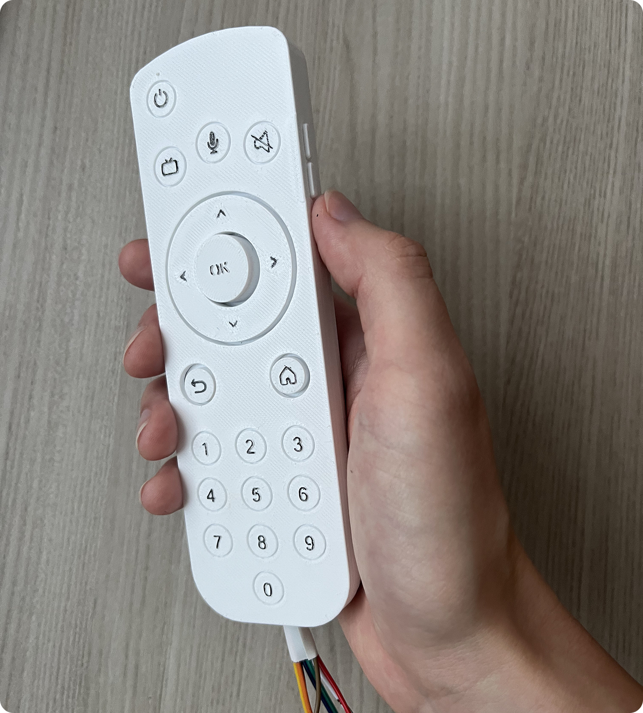
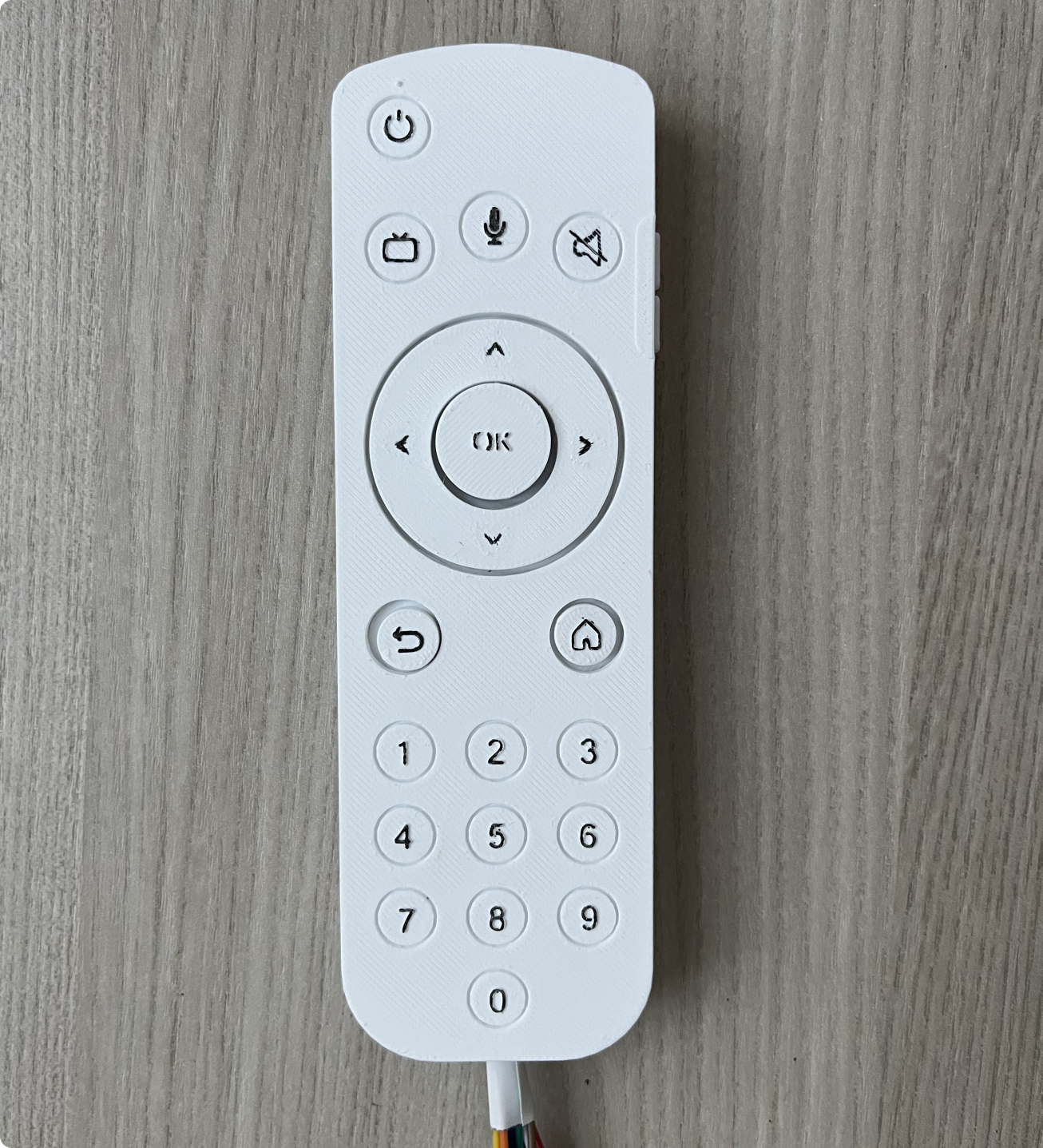
Bridging the digital and physical experience, the remote features essential buttons, a traditional number pad, and side-mounted volume controls inspired by smartphone Ergünomics. Real-time navigation was functionally prototyped via Arduino, while 3D-printed models validated Ergünomics and button placement.
outcomes
To validate the redesign, a PREMO emotion measurement was administered to 6 participants, and a System Usability Scale (SUS) questionnaire to 10. The final ecosystem successfully generated 90% positive emotions (Pride and Satisfaction). SUS results further confirmed a dramatic reduction in cognitive overload, proving the system is highly learnable and confidence-building.